Tuesday, 24 May 2011

........Designs for my garment......

After, my research I decided on a colour scheme by doing some rough sketches and trying out different colours together using water colours.  These colours came from my mood boards and I decided on the colour scheme of green and black as, they stand out from each other and they are not typical circus colours. Here are some of my designs:   


It took me a while to decide on which design i would choose for my final garment but eventually i decided on this design:


My Final Dress !


..........Black,Green,Black,Green.......

Saturday, 14 May 2011

......Sketching the circus......

Here are two of my observational drawings from when i went the circus:


......Pencil,Paint,Pastels.....

Tuesday, 10 May 2011

.....Creating the mood....

If you have looked at my earlier blog on my final major I have put up some pics of my mood boards and on this post i am going to talk about what i have researched to create these mood boards. 

I first looked into who designed for the singer Pink when she wore circus costumes in her music video. I found out that it was the designer Bob Mackie that designed them. Bob Mackie is a costume designer who was born on the 24th March.1940 in Monterey Park, California, United States and here are a few of his designs that Pink wore:


Also, I came across a photo shoot called, 'The chicest show on earth' in this they stick to the primary colours of red, yellow and blue these are usually found on circus garment. However, they mix them with darker colours for the garments to make them stand out from the background. The photo shoot is by a creative marketing agency called, Laspata DeCaro that are based in New York and were founded in 1989. Here are a few images from the shoot: 


In my research i came across loads of different things inspired by the circus but one of my favourites that i came across is a photographer called, Wendy Bevan the reason why is because she does her shoots very different to all the ones that i have seen as, they are not perfectly clear images and have been made to look old and some the models are even moving to create a rough look. here are a few from, 'The freak show' which is circus themed: 


Another, thing that I came across while I was researching was a charity called, 'Circus Child', that helps to support community based circus groups all over the world.They aim to spread messages about the health and education of performers. The thing that drawn me to this charity was the photo's that they use to promote their charity as, they are in the theme of circus here are some of them: 


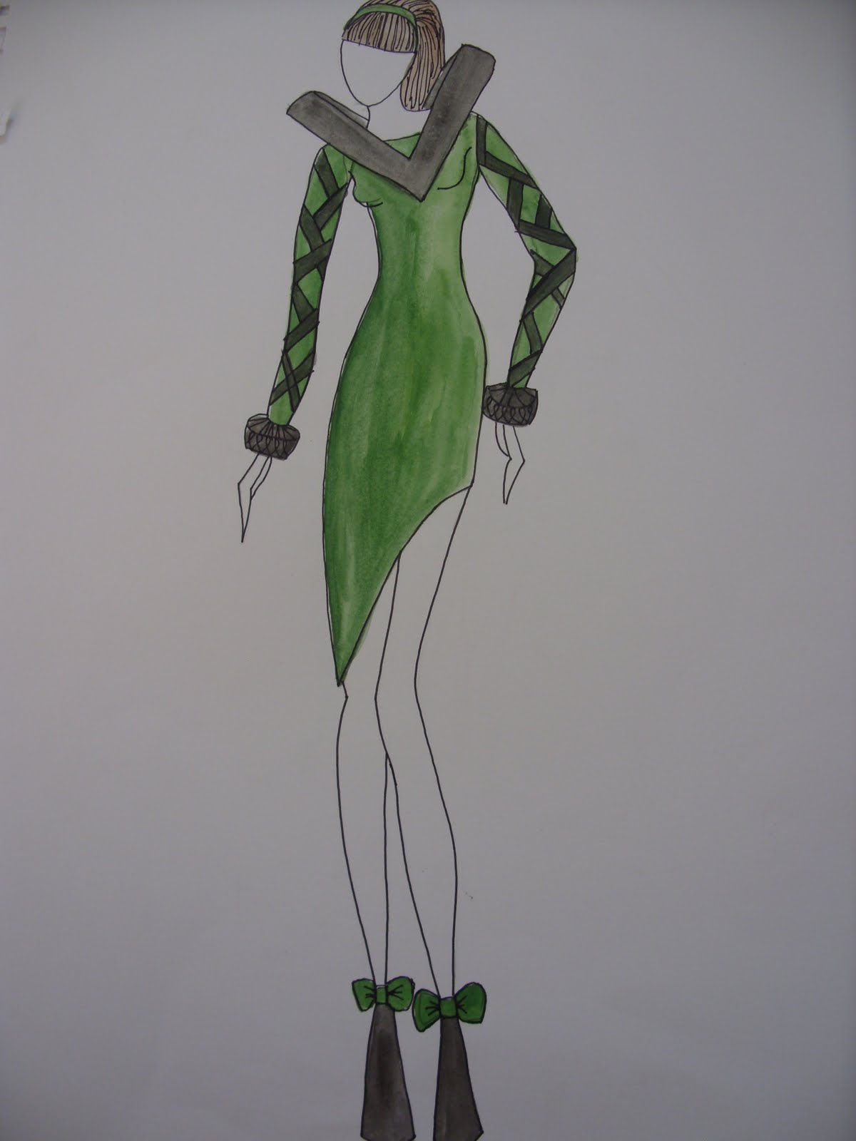
I also, came across a designer called Anna Sui who created a collection in 2010 with the theme of circus. She showed her dedication for fashion at a young age as, she loved to dress up her dolls as if they were at the academy awards. Here are a few of her designs:


.......Circus,Colours,Creations.......

Tuesday, 3 May 2011

........Advertising the end of year show.......

For the end of year show I have been making various posters to try out different layouts for a poster to advertise the show. I haven't yet chosen my final poster so I will upload my final poster when I have decided on it. Here are some of my poster idea's:


........Posters,Posters,Posters......

Tuesday, 26 April 2011

.......Circus Combined with Elizabethan.....

For my final major project in my second year of Level 3 national diploma in fashion and clothing I have chosen to combine circus with Elizabethan. The reason for this is because I came across an image from Vivienne Westwood 's Comic Relief 2011 collection and one of the images the model is wearing an Elizabethan ruff and it reminds me of a clowns ruff. I feel that these things work very well together. Here is the image:


I have also, done much more research for this project and created two mood boards:


.....Elizabethan,Circus,Elizabethan......

Monday, 25 April 2011

......Don't dump it ! Recycle it !......

In Warrington Golden Square a few of the students from Warrington Collegiate were chosen to display their garments made by using recycled materials such as, denim, crisp packets, tea bags and more. I am one of the students that was chosen and the garment is my Alice in Wonderland inspired garment that i created in my recycle project way back in my first year of college. I also, had to go to the Golden Square for a photo shoot that was later put into Warrington Guardian on the 21st April.2011.


 I really enjoyed joining in with this as, I feel recycling should be a part of everyday life for everyone as it's really important to look after our planet and stop waste that can we reused from filling up landfill and creating less and less space to dump our waste. So, next time your about to bin something THINK! , 'Could this product be recycled?'


..........Recycle for a healthy planet.....

Monday, 21 February 2011

.....The Clowness recreated.....


The day of the photo shoot it started off with doing my hair and makeup. This went well as; it was how I wanted it to be. The reason why I chose to have tears going down my cheek is because, in the original painting of The Clowness is off stage and is uncovering what’s underneath her stage mask. So, I’ve brought that same idea into my photo shoot in a way that everything may not be as it seems.


This photographs above and below is to show the makeup and hair they have not been edited.

After, these photographs were taken I then got two chairs and put red fabric over them. I then sat on the chairs in the same position as; The Clowness was in the painting I have chosen. Here is a few of them that haven’t been edited:


After, the photo shoot i edited my photo by putting a background in and changing colours and more. Here is my final image next to original painting:


..........Click, Flash, Boom.......


Tuesday, 1 February 2011

......Clowness in the making.....


I Started my dress by making the sash for my dress. I made this by, gathering netting and stitching three layers together. After, this i gathered and stitched two layers of organza together for each one using a blind hem on the edges of the fabric. I then pinned them onto the mannequin as shown in the photograph above.


To add to this, I added a sleeve to my garment making it the same way as I made the sash. However, I stitched the sleeve into a ribbon so that it can be attatched to the dress later in the making of my garment. I will also, do the same with the sash.


This is my garment with the bottom of my dress stitched together. What i'm going to do next is make top of my dress which will be strappless and low backed.


This is my dress after i stitched the top of the front of the dress together with the sleeve pinned in.


The front of the final garment.


........Sewing, stitching, snipping.....


Thursday, 27 January 2011

.......Netting,Ribbons,Organza........


 These are samples I have made to create the frill and the sleeve of my final design. I tested out different layers of organza and netting to see how many I wanted to have on my final garment, to do with how it puffs out and the brightness of the colour in contrast with the navy dress underneath.


...Cut,Pin,Sew...

Tuesday, 25 January 2011

.......Circus inspired fashion illustrations....

After, researching the artist Lautrec, i went onto my dress designs for the  photo-shoot. I want the dress to be a simple floaty dress with something going over it or maybe with a sleeve as, i will be photographing the back of the model. So, the detail needs to be on the back rather then the front of the dress. Also, the main focus point on the painting i have chosen is the yellow ruffle on the Clown so, I'm keeping this idea within my image.

Here are some of the fashion illustrations for my modern masters:


I did a few more fashion illustrations after this, then i came up with my final design because, Ive changed the frill from yellow to red I will change the bottom of the background of the photo shoot to yellow so, they will be switched around. Here is my final design:


......Red, Yellow, Blue.....

Saturday, 22 January 2011

........Experimenting with materials.......

For these experiments I tested different materials to create a similar effect as the artist used on his painting, for the background for the photo shoot.


 For this experiment I tested using blue acrylic paint and oil pastels. I tested on white sugar paper, trying out what different strokes looked like and what ways worked best. I found it worked well with less paint on and going the same way.


For this test piece I used yellow this time on green sugar paper to see if it will stand out better then the first piece. I used acrylic paint first and with a dry paint brush I dragged the paint across the page going all different ways. Over, this I worked into the lines using yellow oil pastel. I think the yellow isn’t bold enough for the background of my piece.


For this sample I again used blue acrylic paint and a dry brush and dragged the paint but this time all the same way. Then I dipped blue ink down the page. To finish this piece I worked into it with blue oil pastels. This is my chosen piece for the background of my photo shoot as, this one will work best with my image as, it looks most like the artist affect but with my own style.


The image above is a drawing of The Clowness, New York 1895 and below is the actual painting. The drawing is my version of the painting. I used water colours, acrylics and pastels on this piece.


....Acrylic,ink,pastels...

Tuesday, 18 January 2011

.......The mysterious Lady......


The Clowness - Cha-U-Kao-O , 1895, Paris

 This painting is by Toulouse Lautrec and I've chosen this painting to recreate in my Modern Master Piece project. Lautrec was a french painter, print maker, illustrator and a draftsman. He was born on the 24th November. 1864 in Albi, Tarn, France and later died when he was 36 on the 9th September 1901. He was in the Post-Impressionism art movement.


The photograph above is of Toulouse Lautrec.

Here is some more of his paintings of The Clowness or other circus pieces:


At the Moulin rouge 1895

New York 1895

Toulouse Lautrec was fascinated by The Clowness and he painted her many times. However, the image I have chosen she is not on stage; like the other paintings of her where she is on stage. So the painting is showing her true self of stage and looks like she is in a house away from her performing; uncovering her stage mask revealing what’s underneath.


Toulouse Lautrec is from the Post- Impressionism art movement. Post- Impressionism is the term used for French artists since Manet. Roger Fry made up the term in 1910. Also, they rejected the impressionist’s limitations. The Post-Impressionist continued using vivid colours, thick application of paint, distinctive brush strokes and real-life subject matter. However, they were more likely to emphasize geometric forms, to distort form for expressive effect and to use unnatural or arbitrary colour. Most of these artists were younger then the impressionists.


........Clowns,clowns,clowns....